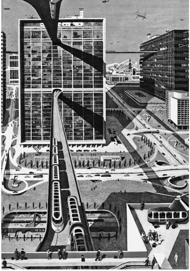
Figure C.1 ‘Man must travel’. Illustration of a section from the children’s book Adventure of the World by James Fisher 1954: the artwork for the book is attributed to Kempster and Evans, also known to have painted a mural for the Festival of Britain. William Kempster (1914–1976) was probably responsible for this image, as it rhymes with his pictures of 1930s aircraft in London’s Science Museum
Conclusion
One page in a now obscure children’s book of 1954, Adventure of the World, epitomises the excitement of modernity (Figure C.1).1 It shows the landscape of a modern town with distant hills behind, and boxy modernist buildings with generous areas of grass between. It is overrun with every possible kind of vehicle whizzing about: not only cars and trucks on highways, but suspended monorails, aeroplanes and helicopters. The thrill of speed and freedom is presented as the very epicentre of modern life. Consciously or unconsciously, the artists, Kempster and Evans,2 leading illustrators who had been involved in the Festival of Britain, were drawing on ideas from CIAM and the Charter of Athens, particularly the division of the city by four functions and the obsession with sunlight and air,3 but perhaps inspiration came also from science-fiction films such as Metropolis and The Shape of Things to Come. If so, the sanitised view presented to the child lacks the sinister, dystopian moments of those films. A glorious future is depicted, with the new world of gadgets and the relatively new freedom of driving at unrestricted speed on empty roads, or flashing across the landscape in a clean electric train, personal flight still a promise. There seems no limit to economic growth, no end to resources, no oil crisis and certainly no ‘spaceship-earth’. Everest had just been conquered, parts of the globe were still being explored, but the hills and dales punctuated by cottages and steeples continued their cosy existence. The homely landscape of ‘on foot’ was taken for granted, and the walking of short distances remained as essential as it was banal.
Not until 20 years later was Bauen als Umweltzerstörung published by the Swiss architect Rolf Keller (Figure C.2). This picture book for architects was inspired by Rachel Carson’s Silent Spring, and its title translates as Building as Pollution.4 Keller fulminated against the destruction of the Swiss landscape, criticising not only the imposition of the motorways, but also suburban sprawl and the growth of non-places. In a determined swipe against orthodox modern architecture, he showed how the same housing models were being adopted worldwide, and buildings for different functions were all becoming the same. Page after page of before and after showed how places once attractive had been desecrated, buildings always replaced by something worse. For this wake-up call, he naturally selected the worst cases, but the point was well made and reflected widespread experience, coinciding with a wave of conservation, of pleas for a return to ‘meaning in architecture’, and doubts about modernism.5 All the same, a growing population had to be housed, better communications were needed for economic growth, health and hygiene had to be improved, and there had to be economies of scale. For numerous reasons, modernist ways of doing things had become inevitable, but they did not have to be done so hastily, blindly, and with such complete priority given to technical and economic imperatives.
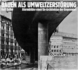
Figure C.2 Cover of Bauen als Umweltzerztörung by Rolf Keller, 1973, an architect’s response to Rachel Carson’s Silent Spring
Functional efficiency and circulation
Movement everywhere in these decades shifted from foot to vehicles, which was seen at first as a liberation. Post-war schools and hospitals were built at the edges of towns on greenfield sites, because there was space to spread out, land was cheaper, and there was the pleasure of a fresh start. In the hospital’s case, quick accessibility by vehicle was helped by its being placed on the ring road. It also suited architects infatuated with the modern movement to be given a tabula rasa on which to compose their sculptural objects, in the manner of Mies or Le Corbusier.6 It is telling that, in the booklet of over 100 pages called Hospital Description, published in 1968 by the King’s Fund to portray an exemplary modernist hospital,7 there was almost nothing about context: no map showing relation to the town to which it belonged, no discussion of how to approach it on foot. The aerial photo shows the small, free car park half empty, today’s parking problems unforeseen. The discussion of movements inside the building is highly selective, great emphasis being placed on the way the ‘running-track’ ward layout allowed maximum surveillance from nurses’ stations. Clean thresholds to germ-free areas such as operating theatres were a high priority, and elaborate flow diagrams show clean equipment being separated from dirty in the basement, but there is almost no discussion of the experience of movement for patients and visitors, nor of way-finding as an issue. The report has little to say on the relative positions and hierarchy of departments, not noticing the sharing of the lowest ward floor between psychiatry and gynaecology, for example, nor justifying the chapel on the roof being shared as doctors’ lecture theatre, a displacement of religion by science.8 Nor is the decision to put the mortuary in the most distant basement explained. Servicing was the primary aim, delivery of patients being treated like delivery of heating, hot water, electricity or medical gases.
Powell and Moya’s Wycombe General was actually well planned for movement and progression (Figure C.3). The drive swept up to an obvious front door, leading to a double-height foyer with generous reception area and gallery to the next floor, and the way to the inevitable lifts was clear and direct. Although lifts always bring the difficulty of suppressing the sense of vertical progression, the architects did create landing spaces on each level with windows on to the outside world, to let visitors reorientate themselves.9 With its relatively narrow plan, the building allowed frequent views out and daylight (Figure C.4). There was a generous staffroom on the ground floor and a spectacular stair down to the staff canteen. However, in the lengthy Hospital Description, these virtues went undiscussed, so that, in the hospital’s presentation as a model, they could have been, and probably were, missed.
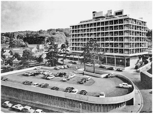
Figure C.3 Photograph of the new Wycombe General Hospital by Powell and Moya, published in The Hospital Description, Gainsborough 1968
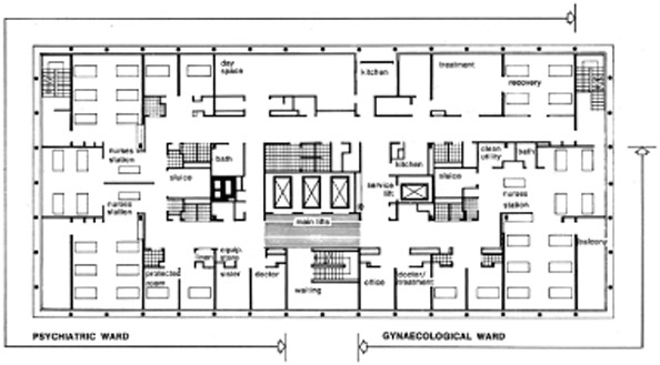
The treatment of circulation as plumbing was widespread and is even more evident in one of the most prestigious hospitals of the period, the extension of King Edward VII by Yorke Rosenberg and Mardall, sited opposite the Houses of Parliament in London and completed in 1966 (Figure C.5). Here, the stacking of floors and central placing of ducts with lifts made for efficient servicing, but the logical counterpart of giving views to patients at the edge was that all else, including teaching and consulting rooms, had to be internal. Corridors became labyrinthine. One would arrive by lift in an artificially lit and ventilated interior, deprived of all natural sense of direction and dependent on signs. There would be several blind, right-angle turns. This was a brand new building, again by ‘good architects’, uncompromised by the alterations and compromises that make most British hospitals even more confusing, but, for that reason, it lays bare the 1960s blind spot. In large and complex buildings, we probably cannot do without signs and numbered rooms, but they do not replace the sense of progression given by the building itself, which is all the more needed in a building that people visit just a few times, as patient or visitor, rather than every day. We need to retain our natural sense of progression just to feel the assurance of being able to retrace our steps, let alone the confidence of finding the place again on the next visit. In recent years, Roger Ulrich in the United States has conducted systematic psychological studies of way-finding in hospitals, showing that people’s confusion wastes endless staff time in redirection, so that bad planning for the experience of movement is inefficient as well as generating increased anxiety among patients, and this disadvantage can be costed.10
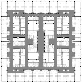
Figure C.5 Plan of King Edward VII Hospital extension, 1966, by Yorke Rosenberg and Mardall
Source: redrawn by Diego Carrasco after a published plan in Thompson and Goldin 1975
This criticism does not apply to hospitals alone. One of the largest and most famous mixed developments in 1960s London, the Barbican by Chamberlin Powell and Bon, is equally guilty. No expense was spared, and its architecture was celebrated as visually exciting, but innocent visitors arrived to find blind corners, lack of hierarchy, difficulties in knowing where they were and which way to go. The main pedestrian deck is so confusing that guidelines in yellow paint have had to be added (Figure C.6). Even within the cultural centre, the proliferation of levels and directions is hard to fathom, but look at the floor plans and there is geometric clarity (Figure C.7). One can imagine that the architects, familiar from the start with the order of their plans, recognised without difficulty where they were in the finished building and so failed to appreciate the problem for other people. One problem was the loss of the old street pattern and clear connections at the edges, for the redevelopment’s planning logic ignored the city’s pattern to follow the grid of the drawing board, the architect’s rational world, which answered claims of standardisation and dimensional coordination. The T-square produces architects’ space, criticised mercilessly by Henri Lefebvre as taking over from space as understood by people in everyday life.11 The architects look down on their plans from above in a godlike manner, but the inhabitants are denied that privilege: they just scuttle around at street level trying to find their way.
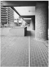
Figure C.6 The Barbican, London: painted yellow line as Ariadne’s thread
Source: Photograph by Peter Blundell Jones
The limits of representation
The problem is not just drawings, but the more general removal from everyday life that accompanies every means of representation. As was made clear in Part 4, when we need to discuss places and experiences that are not immediately present, some representation is indispensible. Maps and models are helpful in showing us relationships that are not immediately apparent and in allowing experience of changes of scale, from house to city and back. Plans and sections do not necessarily imply a placeless mentality: they can usefully be drawn of vernacular buildings that were conceived without them and prove both helpful and revealing, even essential, for study. However, if drawings are used to predict and then execute a new world, their selectivity can easily become geared more to issues of production than to use and experience. The standard drawing sets of the 1960s assumed horizontal and vertical planes at 90º, for example, and preferred to ignore irregular site boundaries, expecting left-over perimeters to be filled with ‘landscaping’. The repeated horizontal floors resulted in stratification, vertical structure limited to a series of shafts, even staircases packed into tubes. Design of non-rectangular forms became difficult and unfamiliar, a challenge to be exploited only in special buildings. As many architects spent a greater proportion of time poring over drawings than within the spaces conceived, they lived increasingly in a world of their own. The problems of being strapped to the grid and the diagram were not universal, for, as we saw in Part 1, there have always been some architects engaged with the experience of movement, and no less so in the modern period. Concern with entrances and staircases, always the focal points, remains. But we have also seen that experience of movement was difficult to discuss and to justify. In the absence of direct experience, it required much imaginative reconstruction through plans, sections and photographs. This is a skill possessed by a limited range of people, and it requires adequate data. Only in specialised architectural books and journals is there normally sufficient space to print the drawings and photographs needed to put the whole story across. Daily newspapers normally rely on a single image, usually an exterior, and, with such limited visual means, progressions of movement can only be carried by verbal narrative. Film and television are not much help, for the camera is seldom used to show an accurate path through a building. It is difficult for technical reasons, but it also offends the conventions of filmic space, as discussed in Part 4. Computer fly-throughs add the third dimension, but usually without adopting the viewpoint of a normal observer, and, as one cannot control the direction of glance or the speed, they seem to run too fast. As with a view from an escalator, one fails adequately to direct one’s attention,12 for on foot one turns one’s head and pauses to look. So, neglect of the experience of movement is due at least in part to difficulties of dissemination, and to the fact that most buildings we think we know exist for us primarily via photographic images. Even experience of buildings visited is displaced in memory by the photos we took to remind us of them.
In car rather than on foot?
Outside buildings, we constantly encounter the problem of the car, and the appeal of Venice is as much lack of cars as presence of canals. Cars mean that roads are no longer for pedestrians, and walking along a motorway leads to arrest: in North America, the term ‘jaywalker’ was invented to describe this misdemeanour.13 Even walking beside a country road now feels threatening, and so walkers prefer so-called ‘bridle paths’, where cars are disallowed,14 and in the city pedestrianised streets, but this has meant a restriction of the walker from whole landscapes to limited reservations. Laurie Lee could no longer find his way from Slad to London, for it is increasingly difficult to walk long distances except in national parks, and bridges are needed over road and rail as well as river. We are now nearly all drivers, forcedly so as society becomes increasingly car-dependent. We get behind the wheel even for the shortest and most local trips, and services are increasingly redeployed to suit the driver.15 As congestion builds, roads desecrate the landscape further and blot out the ancient ways, while new ring roads bring more cars and new points of congestion. Our commitment to the car no longer means freedom: we suffer accidents, traffic jams, pollution and obesity, as well as the mental tension of driving, which is debilitating.16 We spend much time in the car and a substantial part of our salary on it. As we add daily to planetary carbon dioxide and deplete more than our share of resources, we know it cannot go on.
What we could do is walk or cycle where possible and safeguard the walks that exist, particularly the old ways that remember our history. We could reconsider the walk to school, try to source our food locally and use trains whenever possible for long distance, as they require the least energy expenditure per person mile. Besides reducing dependence on the car, we could reduce the priority of tarmac and start making places with a pedestrian alternative. Where highways are inevitable, we should avoid making them into barriers and containers of ghettos, and, where highways turn into streets, we should take a lesson from Ben Hamilton-Baillie (p. 149) by redefining territory, making it clear that it is the car that is there on suffrance, it is for the driver to take care, rather than the pedestrian. We could apply political pressures to refill brownfield sites before violating virgin land, assuring some increased density and some relation between dwelling and social provision. We could demand of developers building new housing schemes that they include some community facilities as a catalyst for neighbourliness, and that, instead of merely calculating the minimum tarmac, they include a public path that goes somewhere, which, when put together with other paths, makes a network for walking. All these obvious things would be on the agenda, were our political system ready to address a term longer than 5 years.
In planning buildings, we must recognise how much has changed since the 1960s. We are no longer the prisoners of the component standardisation that threatened to place a grid across the world and make all buildings the same,17 and we no longer pursue the ideal of total flexibility, which denied buildings specific identities while failing to predict changes that actually occurred. Both these things undermined concern for movement and direction and for place-making in general. We now know that ingenious conversions, for example of industrial buildings, can work well and involve less embodied-energy cost than rebuilding, as well as preserving the memory of the place and the pattern of streets. Servicing has become more sophisticated, along with structural prediction, damp-proofing and cladding, so that it need not dictate layout so much, and, although energy conservation has a higher priority, glass technology has advanced, so that substantial areas can still be allowed.18 Developments in insulation leave less need to minimise external surface, permitting the shallow plan, with its blessings of light, air and views, and avoiding the sin of internal rooms.19 Concern about energy use should cause us to question the ideal of steady-state interiors in terms of both degrees and lux: we should appreciate that it is colder in winter and put on a pullover, and recognise that the human eye works from candle light to full sunlight. We should also be more willing to let buffer spaces mediate external temperature and even allow courtyards as transitional spaces.20 All these things can help make movement in buildings more distinctive and varied. With narrow plans, it is easier to make clear progressions and to articulate territories or departments, allowing identification. It remains advantageous to differentiate ground and top floors, the former as place of arrival, the latter as connection with the sky. Lifts may be inevitable, but they do not have to be the primary or only form of vertical progression, for many prefer to climb a storey or two by stair, in charge of their destiny and spared the wait. Fire stairs are compulsory, but, if they are never used, people do not trust them in an emergency, and so including them in the normal run is an advantage, if their protective opacity can be mitigated.
Architecture framing ritual
Phoning while walking down the street and snacking in front of others on trains are commonplace, yet still the world is full of forms, conventions and prohibitions. We may not have sacred places in quite the same way as the Emperor Shunzhi’s tomb (pp. 185–95), but there are forbidden places at every airport, and crossing frontiers remains an intimidating experience. Lucy Block’s detailed description of the Japanese tea ceremony (pp. 178–84) shows how buildings and landscape can set an atmosphere and frame an event, and we see it more clearly because it is unfamiliar, and yet we put on dinner parties of one kind or another, taking care over the food and presenting our homes and possessions in the best possible light: there is even a reality TV programme about it. Is this not in its own way as elaborate as the tea ceremony? We also generally recognise and respect thresholds and remain sensitive about how far we can enter, and so the role of architecture in framing rituals persists, but it is not something formulaic or easily measurable. It depends on each person’s experience and expectation. Buildings and landscapes matter for the construction of memory, as the examples from Proust show. As we are stuck in the present but for the memories we hold, as explained in Part 2, the buildings we visit and revisit locate us, confirming the stability of physical place in general, not just by the way they look, but from the whole experience they offer. When a familiar building is destroyed, it is something of a death, because experience of it can no longer be confirmed or renewed. Moving house can be a trauma, especially for children, sometimes only second in effect to divorce.21 The broken rituals of home have to be remade, local connections re-established, and some things cannot be done the same way.
It is not the architect’s job to make the home, even if he or she is obliged to make some primary decisions, for the inhabitants add their possessions and decide the daily programme, but we see from the Dong example, presented by Derong Kong (pp. 220–29), that the making of a house can be the expression of a whole society, with rituals acknowledging the stages of its coming about. In such a case, everyone gets to know what a house is, down to its components and their origins as trees, as well as the symbolic meanings played out in the rituals accompanying construction. The relation between house and society is self-evident, as are the roles of all involved. In modern societies, such complete understanding and ownership are rare, for many people must put up with the dwellings they can rent or are assigned, but they still have freedom of expression in the furnishing and manner of use, and every right to flout the architect’s intentions. Ritual framing is still going on, but it is more complicated and less visible.
Real and virtual
Talk of ‘virtual reality’ and ‘reality TV’ tends to focus attention on technologies of increasing sophistication and availability and to fuel that fantasy so well portrayed by Woody Allen in The Purple Rose of Cairo, where the hero climbs through the cinema screen into another world. But that was just an updated version of Alice’s journey through the looking-glass, and it further reflects a much more ancient ability to suspend disbelief. The ability to engage with an imagined scene, even to the point of feeling genuinely scared or shedding tears, was perhaps exploited by the Stone Age storyteller in the same way as it is for us when we see a good theatrical production or a well-made film. The continuing effectiveness of oral transmission is demonstrated by radio plays, even when heard in the car while driving. This is not a question of ‘realistic’ representation so much as imaginative investment in a shared convention: the shower scene in Psycho scares us, not because the filming techniques were ‘realistic’, but because of Hitchcock’s skill in the editing room and clever use of music. Increases in supposed ‘realism’ brought by colour, widescreen, 3D, stereo sound, smells and shaking seats have come and gone, and computer-generated monsters are omnipresent, but often they leave too little to the imagination, and, just because we know the tricks, modern stunts impress less than Harold Lloyd hanging off his clockface.22 We always had a propensity for drama, the ability to imagine another world, but we also usually knew that we left it when we closed the book or walked out of the cinema. What, then, has changed?
Mechanical reproduction has broadened our world and made more experiences available for many more people, but it has also diluted them. Little more than a century ago, if you heard music, someone was taking the trouble to play it, and the rich sound of an orchestra could be heard only when a large group of musicians was in the room. The sound went with the event. Now, with music on disc, we enjoy it when we like, but the whole context of its creation is removed, and we do not even know which instruments are being played. Being so easily reproduced, music bombards us everywhere, even when waiting on a phone call. This is an obvious devaluation. Printed books have been around much longer, and we might assume that spreading the word to so many is an undoubted cultural advance, but, as Victor Hugo pointed out in Notre Dame de Paris, ‘ceci tuera cela’: the book will kill the building.23 He meant that the sculpted biblical stories on the front of the cathedral had become redundant since people had been able to read them in the Bible. Certainly, paper records have relieved the burden of material culture in providing mnemonics, just as written signs have taken over in way-finding. Drama has changed even more. Until the modern period, to see and hear a play, you had to be in the room where it was performed, in the presence of the actors. Even if you did not heckle or intervene, you became caught up in the atmosphere and joined in the strong sense of a shared event.24 Then came cinema, with a new intimacy in being able to see the actors’ faces, but with their presence removed and every performance identical. Still, people gathered, and so there was a sense of audience participation, but with television that was removed, and, though it was at first a family event, it has become increasingly private: each person watching their own thing in their own time. The drama is, thus, also released from its specific physical context. Even real physical events can be lifted from their contexts when an advantageous and easy view becomes available through the machine. In recent years, the Last Night of the Proms has grown beyond the Royal Albert Hall to include parallel events in other parts of the UK, all combined in the televisual experience to make that the most complete and, in many ways, primary version. Even actual participants can be seen eagerly jockeying to appear on the screen and wave to relations. Being on TV has become a universal fantasy, being a TV presenter a widespread ambition, and so-called ‘reality TV shows’ the ladder by which ordinary persons enter that virtual space. It’s The Purple Rose of Cairo all over again, but, of course, behind that screen there is no other world.
The idea that we might disappear totally into a virtual world rather than living in a physical one is exaggerated, for we need to eat and drink, to defecate and sleep and make love, and, as discussed in Part 2, the ‘brain in a vat’ is hardly a workable concept. Yet it is possible to spend too much time as a passive recipient of television or a disproportionate portion of life on computer games, which, though interactive, develop very limited skills. Not only is this likely to produce a perception of the world biased to the reduced parameters of the system, it can also begin to replace and, so repress, the skills of social interaction. Mechanical reproduction has opened a potential for many more experiences, possibly a wider world, but at the price of reduced quality of perception and less social interaction. The latter is the real problem, for the drama has always been with us, but it is now much less clear who is putting on a show for whom and where, and what kinds of reality are being constructed in the process. Excessive virtual movement on the screen has become an increasing distraction from actual movement in the world, but the physical world is still where we are and where we relate to each other most essentially.
Notes
1 James Fisher (1954) Adventure of the World, Rathbone Books, London, p. 47. The title page explains: ‘Art by Kempster and Evans. The paintings sum up and interpret the story with emotional impact and scientific accuracy.’
2 William Kempster, 1914–76, and Barry Evans, born 1923, who together painted a mural at the Festival of Britain in 1951 and made a living as book illustrators thereafter, but have almost fallen off the pages of history. Kempster was educated at Wimbledon College of Art and then at the Royal College. He painted in a Picasso-like manner, but also made accurate colour pictures of 1930s aeroplanes that are now in the possession of the Science Museum in London. The two artists were presumably commissioned by Rathbone Books and must have worked closely with James Fisher on Adventure of the World, as the relation between text and image is close.
3 See Le Corbusier 1973.
4 Keller 1973 (no English-language version).
5 See book of this title by Jencks and Baird 1969; ‘Crisis in architecture’ was declared by the RIBA in a special issue of its journal in 1974.
6 The freestanding Villa Savoye stated the ideal, and photos tended to exclude context even when its role was important, as for example with Erich Mendelsohn’s famous Stuttgart Schocken department store. The Bauhaus stood in glorious isolation, and, although Gerrit Rietveld’s famous Schröder house terminated a row, the other houses were left unseen.
7 Gainsborough 1968.
8 Chapels had been, until the end of the nineteenth century, central to most hospitals; see Thompson and Goldin 1975.
9 Nearly all these enlightened features have since been lost to later space-grabbing conversions: extra offices crammed into landing spaces, division by extra fire compartmentation, the invasion of the ground-floor foyer by private sales outlets, the takeover of the staff lounge for other purposes.
10 R.S. Ulrich, C. Zimring, X. Quan and A. Joseph, ‘The environment’s impact on stress’, in Marberry 2006, pp. 37–61.
11 Lefebvre 1991 (original 1974), p. 361.
12 This was the disconcerting effect of the use of an escalator rather than stairs in the Kunsthaus at Graz by Peter Cook and Colin Fournier: see Peter Blundell Jones (2004) Alien encounter, The Architectural Review, March, pp. 44–53.
13 See news.bbc.co.uk/2/hi/6251431.stm.
14 ‘Bridle path’ means a route taken on horseback and is, therefore, archaic by implication, but the designation may still carry equestrian rights.
15 Jeekel 2013.
16 See ‘How our eyes and minds betray us on the road’, Chapter 3 of Vanderbilt 2008, pp. 74–101.
17 Ironically predicted by the group Superstudio in the 1970s with their ‘supersurface’.
18 See Peter Blundell Jones (2012) Evaluating Kroll’s eco school, The Architectural Review, February, pp. 74–81.
19 See Peter Blundell Jones (2009) Urbanism, city challenges: Sauerbruch Hutton at Sheffield University, Architecture Today, April, pp. 22–31.
20 See Peter Blundell Jones (2011) Wales Institute for Sustainable Education, criticism of new building at the Centre for Alternative Technology by David Lea and Pat Borer, The Architectural Review, January, pp. 035–041.
21 See William Steele and Caroline H. Sheppard (2003) Moving can become traumatic, TLC Journal, Trauma and Loss, Research and Interventions, vol. 3, no. 1.
22 Safety Last, a silent film from 1923.
23 Hugo 1978.
24 The theatre director Peter Brook was memorably eloquent about this in the TV series All the World’s a Stage and other interviews.