6
SPACE OF MONTAGE
Movement, Assemblage, and Appropriation in Koolhaas’ Kunsthal
Movement is a translation of space.1
Gilles Deleuze
Typically, when I asked him [Rem Koolhaas] about choosing between cinema and architecture, he replied that the two fields are more alike than they are different. “You are considering episodes, and you have to construct the episodes in a way that is interesting and makes sense or is mysterious,” he said. “It’s about montage also – whether it’s making a book, a film or a building.” Whatever the general similarities between the disciplines, it is more interesting to observe that Koolhaas practices architecture in the spirit in which a director makes a film. “It’s very scripted, the way people move and the possibilities he leaves for people in his buildings,” Vriesendorp points out. “The experiences are laid out. You go up and you have to look where you’re meant to look. He sees a space and he sees what could happen – a scene in a space.2
From Rem Koolhaas Builds
There are always strengths and limitations in exercising analogical similarities between the fields of architecture and film and while similarities and differences between the two media have been wdiely discussed, it is the operation of montage between the two media that becomes truly significant in some of Koolhaas’s work. Consider the manner in which Koolhaas introduces the Kunsthal, Rotterdam project in S M L XL:
Approach the building from the boulevard. Enter the ramp from the dike. It slopes down from the park. Halfway down enter the auditorium. It slopes in the opposite direction. A curtain is drawn blocking out daylight. At the bottom see a projection screen. Walk down. Turn the corner. Enter the lower hall, facing the park. It is dark, with a forest of five columns. To the right, a slender aperture opens to a narrow gallery. Look up. Rediscover the ramp you used to enter. Walk up. A glass wall separates the people outside. At the top …turn left. Enter the second hall. It is bright, with no columns. Look back. Exit under the balcony. See the auditorium, but don’t walk that far. Instead, turn and take a third ramp. Halfway up, grope through a small dark room …and emerge on a balcony that penetrates the second hall. Return to the ramp, run up, and emerge on the roof. Look down. Spiral back down to the beginning. Exit to the park. Pause. Turn the corner. Pass the restaurant underneath the auditorium. Keep going.3
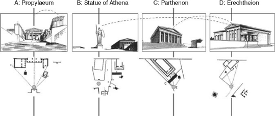
The description of the building has a photomontage layout and a simultaneous narrative that runs parallel to the manner in which one would actually experience a walk through the building. It intriguingly reminds one of Choisy’s analysis and diagrams of perceptual experience of the Acropolis in Histoire de l’architecture that plays such a significant part in Eisenstein’s writing on montage and the role of movement in the spatial experience. In fact, Eisenstein called the walk of the Athens Acropolis “the perfect example of one of the most ancient films,”4 thereby relating the perceptual and peripatetic aspect embedded within architecture and the built environment to film editing techniques.
Eisenstein’s discussion of movement and montage drawing on Choisy’s walk at the Acropolis is no doubt significant when it comes to any architectural discussion of montage. In this case, montage created by a conceptual juxtaposition of shots to create an elegant sequence – a diachronic spatial unfolding which in turn simultaneously and synchronically creates an assemblage of the architectural experience and enriches our understanding of the Acropolis.5The notion of movement is intrinsically related to the idea of path with which Eisenstein starts his discussion of montage and architecture: “the word path is not used by chance,” he writes when talking about cinema, “nowadays it is the imaginary path followed by the eye and the varying perceptions of an object that depend on how it appears to the eye. Nowadays it may also be the path followed by the mind across a multiplicity of phenomena, far apart in time and space, gathered in a certain sequence into a single meaningful concept; and these diverse impressions pass in front of an immobile spectator.”6 There are two important issues of note in this statement; the first is the significance of the path, both in a conceptual and physical sense; the second is the multiplicity of phenomena to create a meaningful concept. While Eisenstein borrows the idea of the path from Choisy’s architectural discourse, the cinematic path in fact becomes a pronounced feature in architectural discussion, especially with Corbusier’s promenade architecturale and later with more overt suggestion to cinematic techniques in Tschumi’s Manhattan Transcripts and explicit reference to “cinematic promenade” in Parc de la Villette. The second issue, that of establishing a single meaningful concept from a “multiplicity of phenomena,” that Eisenstein talks about can be related to Ernst Cassirer’s reasoning that the apprehension of a spatial “whole” can be achieved through presupposing the formation of temporal series. In his discussion of symbolic form, Cassirer emphatically states: “form then appears as potential motion, while motion appears as potential form.”7 This idea of experiencing the spatial whole through movement is crucial when considered in relation to Eisenstein’s position stated previously when discussing physical and conceptual motion that creates “diverse impressions,” perceptual shifts in position to create a “meaningful idea” are particularly of interest when we speak of construction of spatial montage.
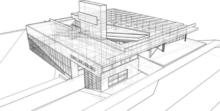
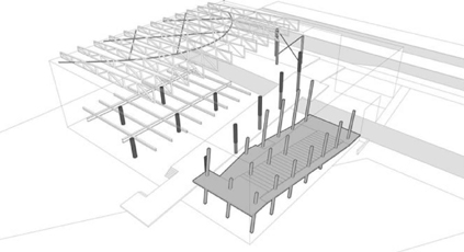
For Eisenstein, Choisy’s analysis brings to the forefront a particular sequential connection of spatial and formal entities to create an overall comprehensive experience that is comparable to a cinematic montage which is also “a means to ‘link’ in one point – the screen – various elements (fragments) of a phenomenon filmed in diverse dimensions, from diverse points of view and sides.”8 In a sense, sharing similarities to Choisy’s architectural experience which is formed through carefully choreographed oblique fragmentary views of discrete building facades that constructs a particular spatial composition of the Acropolis, Koolhaas’s sequential layout of Kunsthal in S M L XL is comparable to what might be a walk-through experience of the building mainly with a deliberate montage of photographs that are inset into a larger interior experience of each space. In S M L XL, in addition to the verbal and photographic description of the walk through the building, one also finds parallel black and white photographs that are either views of the same space or spaces above and below and an intriguing dialogue from Samuel Beckett’s Waiting for Godot that runs in parallel to the photo-narrative. It is the juxtaposition and tension of various conditions that creates the montage effect in the Kunsthal, much like Eisenstein’s description of the montage effect: “when the tension within the movie frame reaches a climax and cannot increase any further, then the frame explodes, fragmenting itself into two pieces of montage.” When we consider various aspects of the Kunsthal it initially appears that montage was the driving factor. Consider for instance the diverse structural conditions that come together in this building; the columns in Hall 1 break from the static condition to alternate and form a dynamic experience within the space; structural conditions in individual halls and spaces follows their own logic. Different structural systems that come together to form a whole in the Kunsthal can also be seen as an exemplification of this montage condition. Cecil Balmond in writing on the structure of the thin red line in Kunsthal’s Hall 2 says: “Why not structure as an animation that provokes synthesis?” further saying: “Altogether there are four proposals to be made in the Kunsthal: I: Brace II: Slip III: Frame IV: Juxtaposition…Strange as it is exciting, raising questions about a bigger adventure, structure talks in the Kunsthal. The dialogue is with architecture; one discipline provokes the other.”9 One can make an argument that the choice of the four proposals sets up a dynamic play, each structural system offers a different sensibility and approach to the architectural problem, and each individual one can clearly be identified within the synthetic whole.
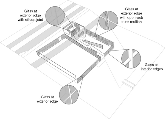
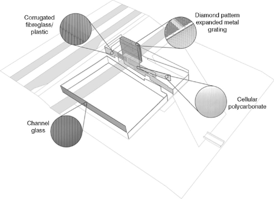
Juxtaposition occurs not only at the structural level but also at the material level and quite deliberately so. Some writers have likened this to deliberate “shocks and jolts.”10 A building that can be seen on some level as a commentary on the architectural discourse from the overall spatial organization to materials and details. For instance, Kunsthal’s four different column types at the front façade have been pointed out by critics, “four different column types that, in their uniqueness can only be read as quotations from a previous time. A cruciform column, two black square columns, a white square column paired with a flat, white, perforated one.”11 The differences and variations at the level of details with materials are similarly quite telling in this project. While in many buildings one tends to see the repetition of details with certain materials, in the Kunsthal, by contrast, even with seemingly similar material combinations there are differences in details. Consider the manner in which transparent glass is detailed in the Figure 6.7 on the rear elevation it is detailed on one side in the interior plane and on the other side on the exterior plane. On the elevation at the auditorium glass is on the exterior edge with an open web truss mullion, while at the front façade plane it is detailed with a silicone joint at the exterior edge.
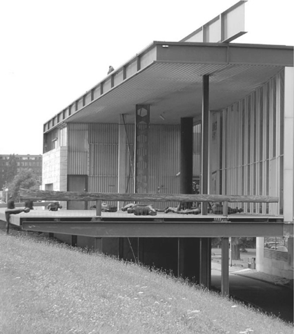
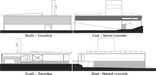
What is perhaps of interest in the manner in which montage is employed in Kunsthal is best revealed by a comparison to a discussion of montage by Stan Allen, who in his analysis of Corbusier’s Carpenter Center says: “Montage, in other words, is not so much a synthetic mounting of one image on top of another as it is an analytic that releases a multiplicity of dimensions and simultaneous meanings from a given figure.”12This idea of montage is evident throughout the Kunsthal especially when one considers the deliberate distillation of modernist history and design. Kenneth Frampton has compared it to Corbusier’s unbuilt project Palais des Congrès, Strasbourg, especially when it comes to idea of the promenade architecturale and the architectural device that encapsulates it as well as pointing to some other formal similarities.13 Jeff Kipnis has also compared it to Mies National Gallery in Berlin.14 Such references with Corbusier and Mies, the two stalwarts of the modernist movement, are not surprising and also present in other projects by Koolhaas. Consider the discrete elevation of each side of the Kunsthal box, unlike most buildings, with the Kunsthal each elevation seemingly belonging to a different building but in this case at one level it alludes to a Miesian pristine box complete with the play on Miesian columns (see southern elevation), at another level, the elevation, instead of putting up a facade, it reveals the section as in the auditorium elevation (see eastern elevation) and is truly “an analytic that releases a multiplicity of dimensions and simultaneous meanings.” This analytic release is also obvious in the allusion to the interior curvilinear broken eggshell auditorium of Corbusier’s Millowner’s Association building that is detailed such that it seems to be floating on the floor through the temporary creation of volume that is created with the drawing of Petra Blaisse’s curtain. It is also apparent in the wooden columns of the hall that Frampton points to as alluding to Dali’s paranoid critical method reminiscent of disembodied trees in the park. As in many other architectural projects, columns are the primary actors,15 the wooden trees, the slanting ones in the auditorium, the play on Miesian ones at the entrance, the circular ones at the ramps, each following their own logic. Much like Tatlin’s corner and counter reliefs wherein the compositions were assembled through material fragments, each alluding to their own histories and discourses, the Kunsthal deliberately makes references to specific icons of architectural discourse through certain iconic elements, spatial organization and compositional operations, and material and details. It is important to bear in mind that for Eisenstein, who made the term “montage” synonymous for a specific technique of film editing, it is also linked to the Russian term for “aesthetic form, obraz (which means ‘image’ as well), is itself a cross between the concept of ‘cut’ [obrez] and ‘disclosure’ [obnaruzhenei]…”16 so the cuts aimed at revealing connections that in Eisenstein that contribute to the overall meaning, and with Koolhaas, the disclosure is in unveiling connections to other icons of modernism and the architectural discourse in general.
That montage techniques are already present in ancient architecture and its experience is obvious in Eisenstein’s use of architectural analogy of Choisy’s Acropolis experience, but is there a modern sensibility in the manner in which this is employed in the Kunsthal? The answer might be that the modern sensibility is that of deliberate appropriation. In the Kunsthal, as in some other works by Koolhaas, there is an appropriation of “motifs” that refer to other works whether in the form of the Miesian column or the Corbu auditorium. This modern sensibility of allegorical appropriation and montage as envisaged by Walter Benjamin also became an important dimension with contemporary art production in the twentieth century, as discussed at length by Benjamin Buchloh and therefore that one can see parallels to ideas within architecture should not be a surprise. In fact, for Buchloh, while one sees parallel
development of a theory of montage in the writings of numerous authors since the late 1910s: Sergei Eisenstein, Lev Kuleshov, and Sergei Tretiakov in the Soviet Union; Bertolt Brecht, Heartfield, and Walter Benjamin in Weimar Germany; and later, Louis Aragon in France. It is the theory of montage as it is developed in the later writings of Walter Benjamin, in close association with his theories on allegorical procedures in Modernist art, that is of significance if one wants to arrive at a more adequate reading of the importance of certain aspects of contemporary montage, its historical models, and the meaning of their transformations in contemporary art.17
The diversity in material and sensibility of each elevation of the Kunsthal have been likened by some critics to Jean Luc Godard’s filmic jump-cut wherein “time between frames vanishes, no longer providing a continuous narrative sequence and momentarily dislocating the viewer with new visual information.”18 Considering that the criteria for jump-cut is generally that there is continuity of viewpoint and discontinuity of duration, in the Kunsthal this is achieved architecturally in its spatial organization and continuity of movement, the dislocation that ensues through assortment of elements such as the column, and also in the variety and manner in materials and details, and the manner in which they occur. The continuous narrative is created by the ramp which is both a formal unifier and a divider that cuts the building into discrete spaces. It can be seen as an apparatus that creates divisions but at the same time becomes a device that weaves these discontinuous conditions. So when Koolhaas writes,
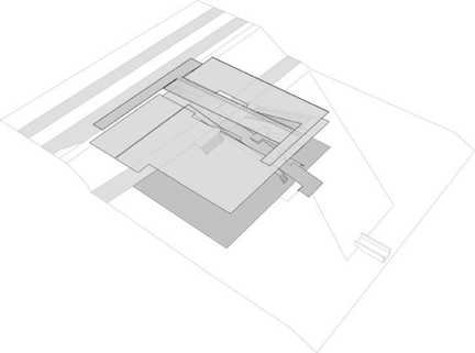
We would keep the same square as a general envelope. The square would be crossed by two routes: one, the existing road running east–west; the other, a public ramp running north–south, the entrance to both the park and the Kunsthal. These crossings would divide the square into four parts. The question then became: How to imagine a spiral in four separate squares?19
It is through the operatiove device – the ramp. In the Kunsthal the ramp is not just a device that connects you to different areas but is itself part of a heightened spatial experience. Here, the ramp is analogous to a narrative thread in the architecture, a path that leads through disparate experiences of each hall with its own structural system to the finale of the roof garden much akin to what Koolhaas calls: “A story,” that “does not have to be told in words, but is simply shown by movement, so that the path has a beginning, and leads somewhere.”20 The ramp in Kunsthal becomes not only the operative device, “the path,” but in a way expands and contracts to encompass discrete and discontinuous spaces and become integral to various experiences within the journey and a spiral through four separate squares. Much like the dialogue between the two main characters in Waiting for Godot, a text that runs parallel to the verbal description of the movement in S M L XL, the photographic layout of the Kunsthal, the cross ramp cuts through the Kunsthal and also weaves spiraling through and navigating spaces within the building. And, much like the characters in the Beckett play who are loitering by the withered tree are waiting for salvation that never comes, meaning in Kunsthal lies in the analytic dimension that refers to other iconic projects and commentaries within the architectural discourse.
Zaum Language and Montage
The choice of selecting and placing the dialogue from Waiting for Godot, a play that has been called one of the most important works of the twentieth century, within Kunsthal’s photographic walk-through layout in S M L XL is especially significant considering that throughout this play there are various instances wherein the dialogue appears disjointed, paradoxical, contradictory, and at times incoherent. In fact, in Act II of the play, Lucky’s speech comes across as rambling nonsense language without structure or punctuation, much in the vein of the Russian futurist poet and playwright Khlebniov’s “zaum” language. This language that he developed with Kruchonykh originated as a “suprarational” or transcendental language of the future, which they called “zaum” which meant beyond sense (um – significance or meaning and za – beyond). Creating a language based on the roots of words and sounds indicated by individual letters, they believed that it would forcefully convey emotions as well as abstract meaning and bring to the forefront words and letters as objects that can be manipulated to express meaning. Here vowels were thought in terms of space and time, and construction was understood in material terms and not as timeless abstraction. Montage-like in nature, the sound and structure of words are of paramount importance in this language. The notion that stable sound material could be uncovered beneath the seemingly disorganized surface variety of language is considered by many critics as a vital and immediate contribution to Malevich’s Suprematist style of abstract painting, as well as to the contructivist art of Tatlin. Embedded in these linguistic constructions of assemblage and cutting that Khlebnikov develops are ideas of montage that undoubtedly had an influence on many designers and theorists including Eisenstein’s work on montage. In fact, in Eisenstein, Cinema, and History James Goodwin quotes Eisenstein in assessing his development through the montage process in October where Eisenstein says “methodology has taken precedence over the construction of the work,” further stating that,
Construction is the principle of Potemkin, while this innovation in methodology he likens to zaum…Rather than a construction of affective meaning, October’s intellectual montage is a methodology of de-familiarization and re-association intended to demonstrate a logic above the seeming transparency of reified social forms.”21
Montage and Layered Space in Zangezi
As discussed initially with Choisy’s influence, the architectural underpinning of Eisenstein’s ideas are now common knowledge but what is perhaps less discussed is the possible linguistic impact of the Russian futurist poet and playwright Khlebnikov’s work on Eisenstein, including what some scholars have called “the ‘montage’ effect” of Khlebnikov’s works especially the “disjointed structure” as “distinctly reminiscent of the ‘shifted’ perspective in Cubist paintings.”22 With Khlebnikov’s zaum language one observes that the montage effect generates simultaneity of meaning that is brought about with the deliberate juxtaposition of disjointed words. The preponderance of phonetic origins of lexicons in his work can also be suggestive of sound montage.
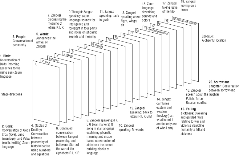
The crystallization of Khlebnikov’s work can be seen in a fascinating poem called Zangezi. This poem was based on some of his earlier works and has been specifically referred to as having been built on a principle of montage.23 This work is significant not only due its deployment of montage but due to its architectural dimension the construction of whic has been referred by some to the notion of language as built out of “blocks of space” and “particles of movement”.24 This poem was published shortly before his death in 1922. Often referred to as a “supertale” (sverkhpovest), Zangezi exemplifies the languages that connect the universe but has no real plot and action. In its construction it is made out of independent sections; Khlebnikov called it, a “supersaga,” and “an architecture composed of narratives.” Constructed of twenty different narratives conceived as planes or surfaces (ploskosti), each representing languages that form a pattern of relationship in the universe,25 this poem has been described by its own author as analogous to architecture: “a story is made of words, the way a building is made of construction units,” further stating, “equivalent words, like minute building blocks serve as construction units of a story.”26 Each of the 20 sections has a distinct theme, for example, the first three sections are languages of different kinds ranging from that of bird sounds to the language of people, the fourth plane deals with theories of historical events in relation to numerical equations, the sixth introduces linguistic and implicit national protagonists with the letters R, L, K, P, G, the seventh one has the war of the alphabets, the eighth has the language of the stars where each letter and sound of the alphabet is in fact an arrangement of points in space, while the last one having the contrast of Laughter and Sorrow is in fact a theatrical metaphor, “a crystallization of all human endeavor in the struggle of Laughter with Death.”27
At the level of the overall construction each plane works as an individual construct and much like Zaum language significance is given to phonetic utterances and meaning attributed to word roots. Many of Khlebnikov’s poems play with what can be termed as the “morphological” and the “phonological” structures of language and meaning. He makes frequent use of forms that tend to produce maximum ambiguity, such as neologisms, homonyms, and puns. Montage in terms of cutting and assembling is an inherent part of this process. For Khlebnikov, not only could the structure of a word be examined and its latent meanings laid bare, but also new words could be created on the models of existing ones. Much of his writing, therefore, has to do with texture of language, with poetry as made words.28 The influence of patterns and tropes from folklore and chants, incantations can be seen throughout this work. In his poems, such as Incantation by Laughter, he constructs composite and complicated patterns of modifications of the Russian word for laughter “smekh” by adding prefixes and suffixes that reveal various shades of meaning. What is especially significant in this regard is the repetitive and evolving sounds which are scarcely intelligible. As Milner very aptly says:
Its repetitive transformations emphasize inexorably the sound of the root word so that this takes precedence over its meaning…This process of referring almost instantaneously from a word’s structure to its meaning has been interrupted by Khlebnikov through insistent repetition and through the sequence of shifts in the role and implications imposed upon the root in use…sound then supersedes sense.29
The physical structure in a way gives its meaning by creating the sound that is like laughter, therefore focusing attention on the materiality of the word. The deliberate fragmenting, cutting, and an attention to rhythmic aspects of sound can be seen in the works of visual artists and architects. For instance, Tatlin’s corner and counter reliefs can be seen as an exemplification of Klebnikov’s Zaum language. In Zangezi, this strategy is employed in plane VII with consonants, plane VIII with phonetic free and re-associations, and with mystic syllables in plane IX. Not only then can one see montage through zaum language within individual planes as in “Plane One: The Birds”, but with the deliberate use of earlier poems to create this “supersaga” there is also an element of appropriation, albeit of his own work. An aspect emphasized by some scholars who write: “Zangezi preoccupied the poet from 1920–21, and was “collated and decided” in January 1922,” further stating that it was “a summary of Khlebnikov’s oeuvre, being composed of fragments, many already written, representing not just each of Khlebnikov’s genre – lyrical, narrative, theoretical – but every plane of his language…”30
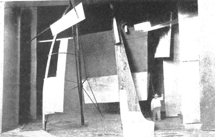
FIGURE 6.12 Vladimir Tatlin’s model of the set for Zangezi, 1923, whereabouts unknown; shows the twentieth section of the poem with the figure on left representing Laughter and on the right, Sorrow (reproduced from Fülop-Miller, Mind and Face of Bolshevism, 1927)
Collage and Set-design for Zangezi
Significantly, the theater production of Zangezi by Tatlin employs the idea of layering and montage in a very fascinating manner. Not only did Tatlin produce the play, but he also directed, acted, and designed the sets and costumes of Zangezi which was performed as a homage to Khlebnikov after his death.31 The performance was held in conjunction with an exhibition of Tatlin’s reliefs and other works emphasizing the link between Khlebnikov and Tatlin’s work.32 The sets were based on Khlebnikov’s attitude to words as the expressive elements and the fundamental building units of literary works as evident in Tatlin’s writing on Zangezi: “the performance of ‘Zangezi’ is based on the principle: ‘The word is the building unit, the material is the unit of organized space…he [Khlebnikov] looks at the word as plastic material.33 The properties of this material make it possible to manipulate it for the building of the ‘government of language’. This view of Khlebnikov’s gave me the opportunities for working on the production. Parallel to the word structure I decided to introduce a material construct.”34 To focus further on this aspect, a projector was used much like a spotlight to reveal the properties of the material in addition to directing the spectator’s attention. Its highlighting of specific areas introduced a certain sense of order and sequence but at the same time the play on the emphasizing areas by focusing light on them could then be understood as a diachronic feature that constructs meaning much like the assemblage of montage shots in a film.
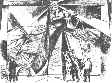
FIGURE 6.13 Vladimir Tatlin’s sketch of the set for Zangezi, 1923 (reproduced from Fülop-Miller, Mind and Face of Bolshevism, 1927)
With Khlebnikov having a considerable influence on various artists and architects including Tatlin, it would not be far-fetched to consider the ideas of montage in phonetic, linguistic, operational, compositional, and material terms having an influence later on Eisenstein. In fact, Naum Kleiman has attributed to Viktor Shklovsky, the Russian critic and writer who was a close friend of Eisenstein, the statement reminding Eisenstein, “Remember you are the Khlebnikov of Russian film. Do not neglect your task.”35 While Eisenstein identifies Japanese writing being primarily representational as being identified with montage and thereby transferred to the cultural system that also includes haiku poetry, Sharaku’s prints, and Kabuki theater, featuring montage properties and, therefore, cinematographic in nature,36 it can be probably be directed towards non-representational modes of production such as Khlebnikov’s zaum language. So while much of the discussion regarding montage has naturally focused on Eisenstein and rightfully so, Khlebnikov’s work is quite significant even when it comes to Koolhaas’ Kunsthal and it would not be far-fetched to compare Koolhaas’ way of alluding to and commenting on Modernist iconic architecture through deliberate use of elements as in the columns, or vestiges of other works in terms of the play of architectural palette, or even material conditions, to Khlebnikov’s use of morphological and phonological structures of words and their roots alluding to their meaning and deliberate combinatory conditions to create new words and new meanings.
There are similarities in the composition at the level of the parts and the whole both in the theater production as seen in costume design to set design and in the poem as seen in the assembly of words and the overall composition of planes. One observes quite obvious formal and material similarities between costume and set design of Zangezi and Tatlin’s corner and counter reliefs that can also be seen in this light and understood as compositions in space that have significant montage operations. So even when Eisenstein compares ideas of montage in architecture and cinema in his discussion of the Acropolis experience as “a montage sequence for an architectural ensemble…subtly composed, shot by shot,”37 with Koolhaas’ work there is obviously a modern sensibility in the manner in which he deploys montage strategies and procedures that in this discussion I relate this to Khlebnikov and Tatlin’s work. However, it is in its appropriation of “motifs” or a specific references to a design palate of modernist icons within architecture that one observes what the montage actually achieves – “an analytic that releases a multiplicity of dimensions and simultaneous meanings.” Here montage is experienced fundamentally through movement and achieved through appropriation and re-assembly. In a sense, this is reminiscent of Walter Benjamin’s discussion of modernity or more appropriately “the modern” through the allegorical appropriation and montage that is present in his analysis of some “motifs” in Baudelaire.38 Montage then, as a procedure of fragmentation, appropriation, and re-presentation, changes how we experience a work and activates a new space of communication within and across media.
Notes
1 Gilles Deleuze discussing Bergson’s theses in Cinema 1: The Movement – Image translated by Hugh Tomlinson and Barbara Habberjam (London: Athlone Press, 1986), p. 8.
2 Arthur Lubow, “Rem Koolhaas Builds” in The New York Times Magazine, July 9, 2000, p. 7.
3 Rem Koolhaas, Bruce Mau, and Hans Werlemann, S M L XL (New York, Rotterdam: Monacelli Press, 1995) pp. 432–465.
4 Sergei M. Eisenstein, “Montage and Architecture” (CA. 1937) with an introduction by Yve-Alain Bois in Assemblage 10, December 1989, p. 117.
5 This was initially discussed by John Peponis in a PhD seminar at Georgia Institute of Technology in 1994. See chapter on “Parthenon and the Erection: the spatial formation of space, politics, and myth” in Sophia Psarra, Architecture and Narrative: The Formation of Space and Cultural Meaning (London & New York: Routledge, 2009) pp. 19–43.
6 Eisenstein, “Montage and Architecture,” p. 116.
7 Ernst Cassirer, The Philosophy of Symbolic Forms, volume 1: Language (New Haven: Yale University Press, 1955), p. 100.
8 Sergei M. Eisenstein, “El Greco y el cine” (1937–41), in Cinématisme: Peinture et cinema, ed. François Albera, translated by Anne Zouboff (Brussels: Editions complexe, 1980), pp. 16–17.
9 Cecil Balmond, Informal (London & New York: Prestel, 2007) pp. 71–72.
10 Veronica Patteeuw, Considering Rem Koolhaas and the Office for Metropolitan Architecture (New York: NAi, 2003), p. 59.
11 Cynthia Davidson, “Koolhaas and the Kunsthal: History Lesions” in ANY, 21.39.
12 Stan Allen, “Le Corbusier and Modernist Movement: The Carpenter Center for Visual Arts” in Essays: Practice, architecture technique and representation (New York: Routledge, 2009), p. 105.
13 Kenneth Framption, “Rem Koolhaas Kunsthal a Rotterdam” in Domus 1993.
14 Jeffrey Kipnis, “Recent Koolhaas” in El Croquis 79, 1996, pp. 26–37.
15 See chapter on Danteum in this book.
16 James Goodwin, Eisenstein, Cinema, and History (Campaign, IL: University of Illinois Press, 1993), p. 96.
17 Benjamin Buchloh, “Allegorical Procedures: Appropriation and Montage in Contemporary Art,” in Artforum, Volume XXI No. 1, September 1982, p. 44.
18 Davidson, “Koolhaas and the Kunsthal: History Lesions”, 21.39.
19 Koolhaas et al., S M L XL, p. 431.
20 Interview with Rem Koolhaas, Interviewer Hilde Bouchez in A+U, 2005 no. 4–19, p. 93.
21 Goodwin, Eisenstein, Cinema, and History, p. 94.
22 Raymond Cooke, Velimir Khlebnikov: A Critical Study, Cambridge Studies in Russian Literature (Cambridge: Cambridge University Press, 2006), p. 23.
23 Robert Leach, Revolutionary Theatre (London & NY: Routledge, 1994), p. 154.
24 Krzysztof Ziarek, The Historicity of Experience: Modernity, the Avant-Garde, and the Event (Evanston, IL: Northwestern University Press, 2001), p. 193.
25 For example, plane one is the language of birds, plane two is the language of gods, plane three is that of people, then there is the astral language, zaum language, and so on.
26 Velimir Khlebnikov, The King of Time. Selected Writings of the Russian Futurian. Translated by Paul Schmidt and edited by Charlotte Douglas (Cambridge: Harvard University Press, 1985), p. 191.
27 Khlebnikov, “To the Artists of the World” in The King of Time, p. 190.
28 Khlebnikov, The King of Time, p. 13.
29 John Milner, Vladimir Tatlin and the Russian Avant-Garde (New Haven: Yale University Press, 1983), p. 12.
30 Donald Rayfield, “Zangezi” in the Reference Guide to Russian Literature edited by Neil Cornwell (Oxon, New York: Routledge, 2013), p. 442.
31 This performance took place on 9th May 1923 at the Petrograd Museum of Artistic Culture.
32 Tatlin, while writing about this aspect in his article On Zangezi says that “On May 9…a performance+lecture+exhibition of material constructions is taking place.” V. Tatlin, “On Zangezi” translated in Tatlin edited by Larissa Zhadova (New York: Rizzoli International Publications, 1988).
33 In the introduction of Zangezi, a poem written by Velimir Khlebnikov, he writes about the analogous nature of literature and architecture: “a story is made of words, the way a building is made of construction units,” further, he says, “equivalent words, like minute building blocks serve as construction units of a story.”
34 Vladimir Tatlin, “On Zangezi” translated in Tatlin edited by Larissa Zhadova (New York: Rizzoli International Publications, 1988).
35 Nikita Lary writes about this in “Shklovsky: The Good and Awkward Friend” in Eisenstein at 100: A Reconsideration edited by Albert J. LaValley, Barry P. Scherr (NJ: Rutgers University Press, 2001), p. 123. In his discussion regarding the support that Shklovsky had been able to give Eisenstein in his theoretical work especially at “one critical juncture; the story comes to us from Naum Kleiman. It was a New Year’s Day, 1933. Eisenstein was in no mood to celebrate: he had returned to Moscow following the abrupt termination of the Qué viva México! Project; the script “MMM” had been refused; he had no contracts at a time when others were working. Coming home from a party and passing through the artists’ compound in which they both lived, Shklovsky noticed lights on in Eisenstein’s apartment, knocked at his door and chided him for staying home. Then Shklovsky added: “Remember you are the Khlebnikov of Russian film. Do not neglect your task.””
36 Yve-Alain Bois, Introduction to Sergei Eisenstein’s “Montage and Architecture” in Assemblage 10, December 1989, p. 112.
37 Sergei M. Eisenstein, “Montage and Architecture” (CA. 1937) with an introduction by Yve-Alain Bois in Assemblage 10, December 1989, p. 117.
38 This modern sensibility of allegorical appropriation and montage as envisaged by Walter Benjamin also become interesting with contemporary art production is discussed extensively by Benjamin Buchloh in “Allegorical Procedures: Appropriation and Montage in Contemporary Art,” in Artforum, Volume XXI No. 1, September 1982, pp. 43–56.
